
Brand Architecture, Naming, Visual Identity, Collateral Design, Signage, Guest Journey, Restaurant Logo & Design
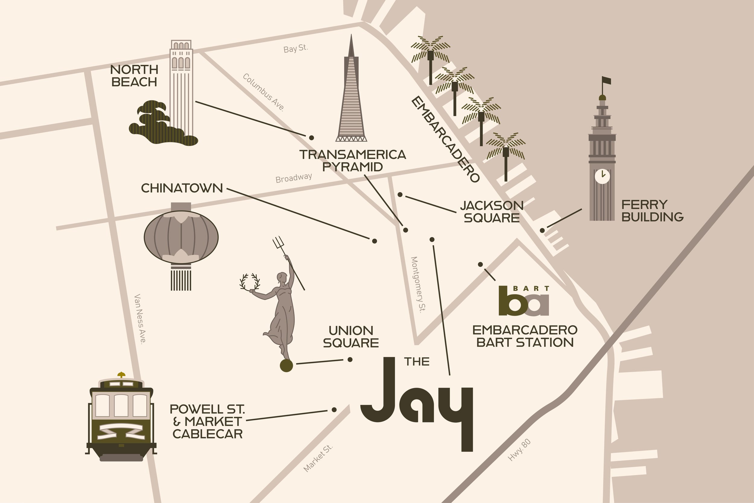
The Jay, a Marriott Autograph hotel located in San Francisco’s Financial District, was built to be the city’s new beating heart within a reimagined downtown landscape.


Our Approach
As a Bay Area-based agency, getting the opportunity to work on a project of this scale in our home city’s Downtown was a true honor. We were able to come into the project after iconic agency Avroko had wrapped their interior design process, which greatly informed our direction for building out the brand.
The building and its design was influenced by large-scale architect John Portman, and struck a delightful balance between urban brutalism and timeless style. RAY Studio developed a rich, decadent logo and color palette, with a hint of earthy neutrals. The logomark needed to stand out in the gray of San Francisco’s Financial District, while also not straying from classic simplicity. This logo would be used on a large and varied scale, so it had to work within numerous applications and styles.

RAY’s Home City as Inspiration
Aligning with Autograph’s brand protocol, our team crafted a Brand Architecture document in tandem with our visual identity work.
The architecture acts as a guidebook for how guests should feel about the brand before, during, and after their stay. Writing a document of this nature further solidified our need for the brand's logo to feel true to San Francisco, and highlighted the importance of a confident visual identity for this property.
We have a deep love for San Francisco and have seen it through its various highs and lows. We strived for this brand’s language and look to feel nothing short of celebratory, reigniting a Golden Age perspective, and remembering why San Francisco was so great to begin with.

The Third Floor
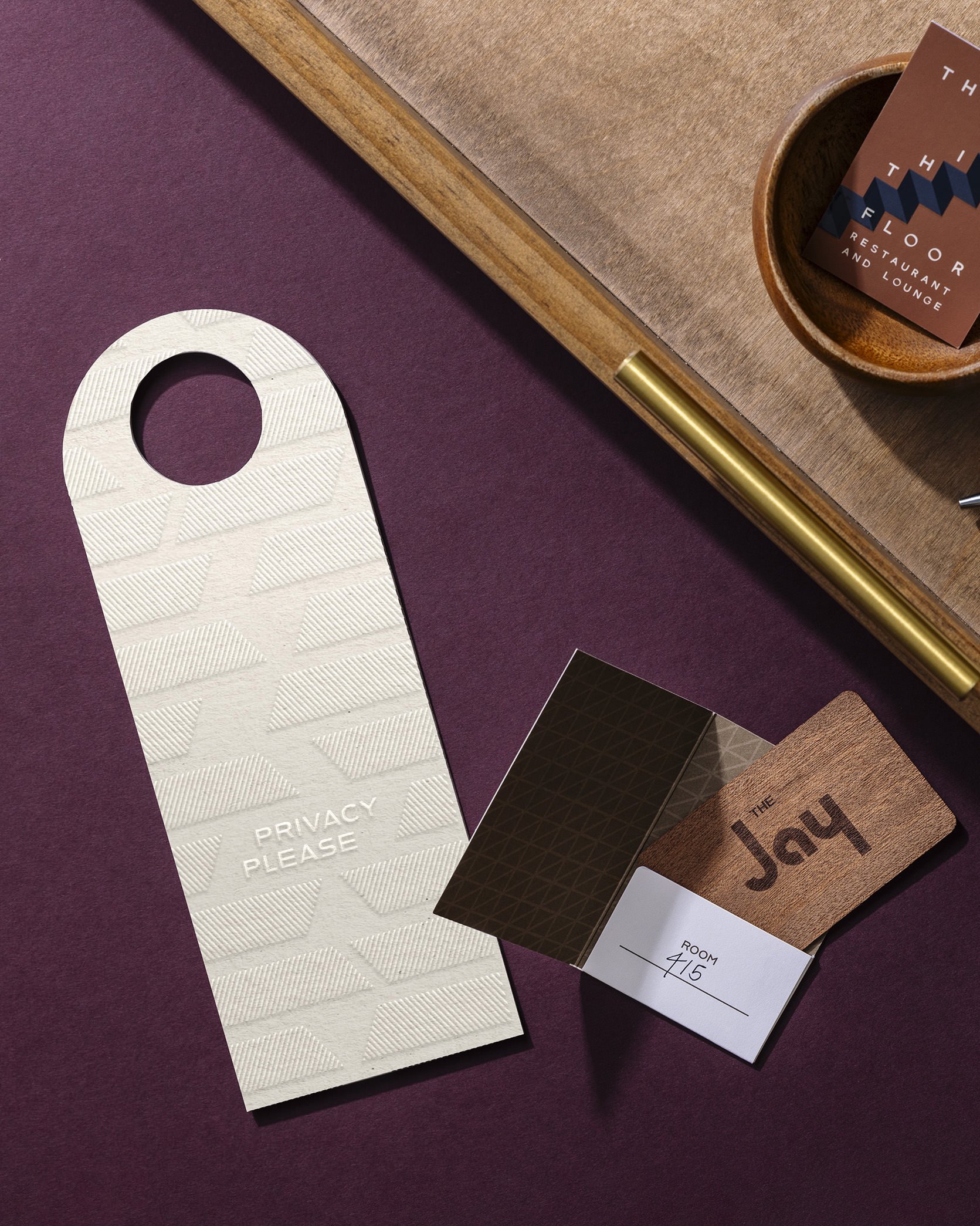
As a part of our branding journey for this project, RAY Studio also executed the logo for the hotel’s signature restaurant concept, The Third Floor. The elevated location of this restaurant, combined with its luxe and textured interiors, lead our team towards a brand that was simple yet playful.
As a complement to the hotel’s branding we used warm, muted tones for this experience, along with an illustrated staircase graphic that we applied on numerous collateral pieces.


