Naming, Visual Identity, Collateral Design, Signage
Led by the talented Charbel Hayek, winner of Season 5 of Top Chef Middle East, Ladyhawk is an impressive addition to the robust dining and nightlife scene of West Hollywood.


Our Approach
Nestled within the Kimpton La Peer Hotel on a side street just north of Melrose, Ladyhawk is the embodiment of Los Angeles’ timeless glamor and edgy mystique.
Knowing the upscale clientele that frequents the area and stays at La Peer, the vision was to create a restaurant brand that gives the already cutting-edge hospitality scene of West Hollywood a run for its money. With a well-known chef at the helm, Ladyhawk was destined for success from the start, a forecast that made our team’s work effortlessly inspired.
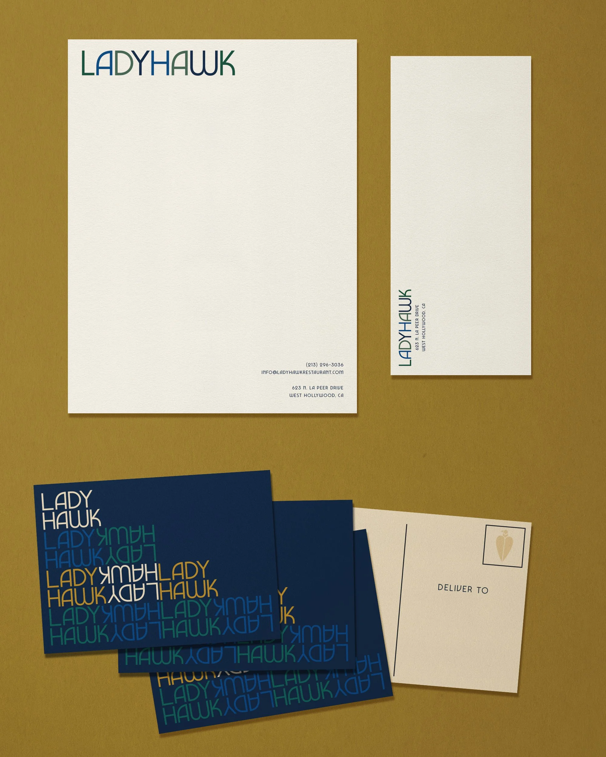
We began with naming, knowing that the restaurant would need a moniker that was catchy yet contemporary. From there, we built a brand that was visually anchored by Mediterranean colors, alluding to the establishment’s food concept, and then brought it to life by using a curvy 1970’s-eque font, and layered collateral applications.


An Icon All It’s Own
Ladyhawk gave our team an opportunity to play with iconography in an impactful way. The dynamic nature of the restaurant’s name revealed a variety of possibilities for a supporting logo mark. The result was a geometric interpretation of Ladyhawk herself, a vision that has since come to life on glowing signage and velvety bar books alike.