
Visual Identity, Website, Apparel, Interior & Exterior Signage, Packaging
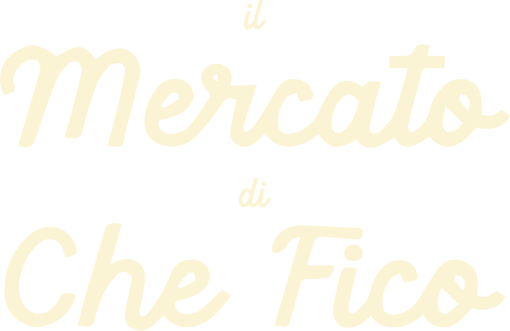
il Mercato di Che Fico is the latest venture from the Che Fico family of brands, located in sunny Menlo Park.


Our Approach
il Mercato di Che Fico serves up high-end Italian grab-n’-go and grocery store fare, delivered with the same flair and ambiance as the full-service Che Fico restaurants located in San Francisco.
With visions of freshly sliced Italian deli meats, smooth scoops of sweet gelato, and freshly-baked focaccia top of mind, RAY Studio embarked on a visual identity exercise for this outlet that felt colorful, retro and authentically Italian. This project involved extensive signage and packaging development, requiring a brand that would not only look great on a website, but that would also come to life colorfully and practically across interior and exterior signage and POS systems.

The Making of an Italian Market
Inspired by the nostalgic and iconic signs of Italy’s urban centers, the identity for il Mercato di Che Fico merged elements of old and new to make for a market experience unlike any other in Silicon Valley.
The il Mercato di Che Fico experience requires a uniquely comprehensive collateral and signage package to accommodate its high-touch user experience. RAY Studio designed everything from sandwich fry paper to shelf talkers, ensuring that each brand touchpoint represented its authentic Italian inspiration and Che Fico’s unmatched style.


